Multiformat branding with _brand.yml
Overview
Quarto supports brand.yml—a single YAML file that can be used to customize the appearance of your documents across multiple formats. This is particularly useful for organizations that need a unified look across various formats.
As an example, consider the following _brand.yml file:
_brand.yml
color:
  palette:
    dark-grey: "#222222"
    blue: "#ddeaf1"
  background: blue
  foreground: dark-grey
  primary: black

logo:
  medium: logo.png

typography:
  fonts:
    - family: Jura
      source: google
  base: Jura
  headings: Jura
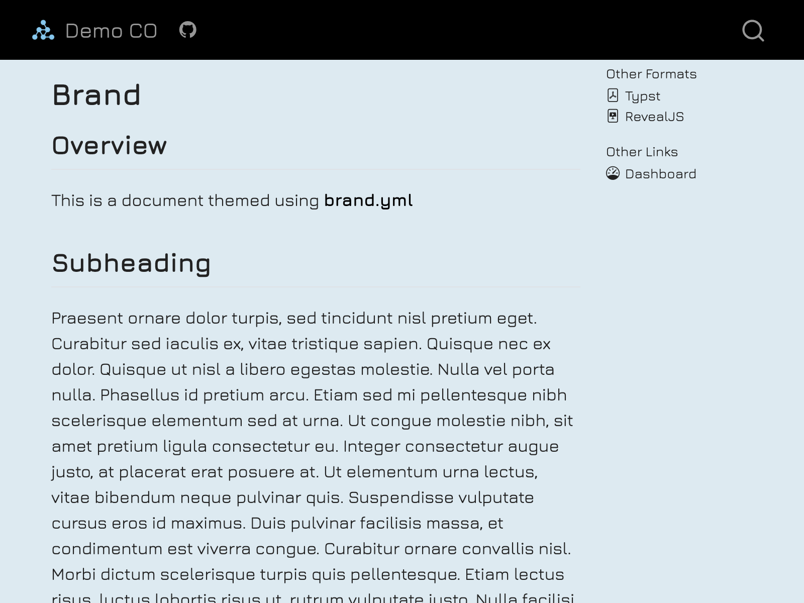
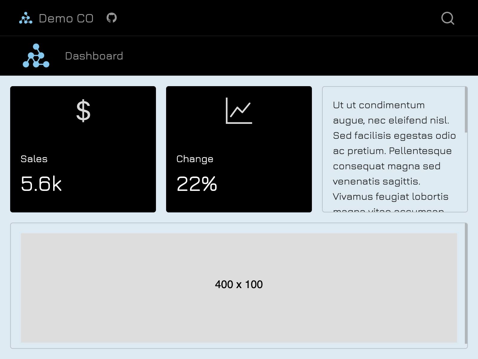
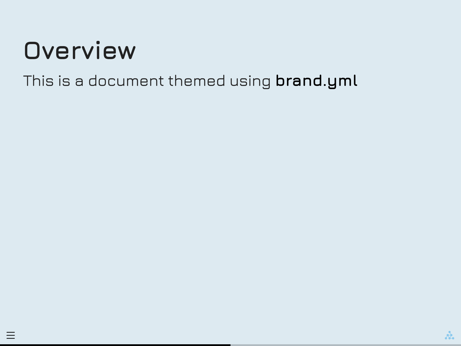
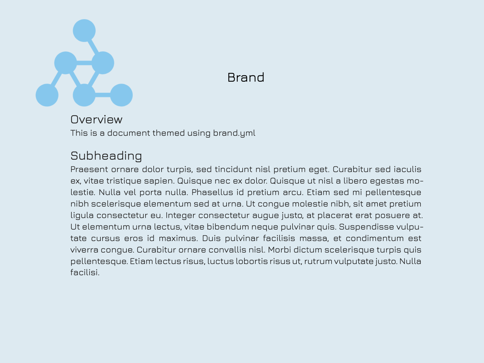
When this _brand.yml is placed in a project, webpages, presentations, PDF reports, and dashboards will share a common appearance:
View the example: Source | Live website
On this page:
Learn how to add a brand file.
Learn about the elements of brand.yml and how they are used in Quarto.
Learn how to access brand values outside of the brand file.
See a more comprehensive example.
The brand.yml specification is an active area of work at Posit. Quarto’s support for brand.yml is not yet complete. For now, we’ve highlighted places where Quarto doesn’t yet support the full spec with special Limitation callouts, like this one.
Currently, the formats that support brand.yml are: html, dashboard, revealjs and typst.
Applying Brand
To specify a brand, create a _brand.yml file in the root directory of your project (i.e. alongside _quarto.yml). Quarto will detect the presence of _brand.yml and automatically apply the brand to all documents of the supported formats in the project.
You can create a _brand.yml file outside of a Quarto project (e.g. without a _quarto.yml). In this case, _brand.yml will automatically apply to documents in the same directory.
You can also set brand options in a document by specifying brand elements under the brand option:
document.qmd
---
brand:
  color:
    background: "#eeeeee"
---
If you set brand in a document header, it will replace the entire brand from _brand.yml.
You can disable brand for a document by setting brand to false:
document.qmd
---
brand: false
---
You can put _brand.yml in a subdirectory of your project, and then use the brand key to specify the path to the brand file. For example, to use the brand file at brand/_brand.yml for a single document, add brand to the header:
document.qmd
---
brand: brand/_brand.yml
---
To use the brand file at brand/_brand.yml for all documents in the project add brand to _quarto.yml:
_quarto.yml
brand: brand/_brand.ymlPaths specified in _brand.yml are relative to the location of the brand file.
Brand Elements
The elements of brand.yml are specified in the documentation for the brand.yml project. In this section, learn how these elements are used in Quarto.
Color
Use color to define your brand’s color palette and map your palette to the roles colors play, a.k.a semantic colors. A simple example might define the value background to a light blue:
_brand.yml
color:
  background: "#ddeaf1"
Use the palette key to define a set of named colors that can be referenced elsewhere in the _brand.yml. For example, you might define blue and set it as the background:
_brand.yml
color:
  palette:
    blue: "#ddeaf1"
  background: blue
The most commonly used semantic colors include foreground, background and primary:
_brand.yml
color:
  palette:
    dark-grey: "#222222"
    blue: "#ddeaf1"
  background: blue
  foreground: dark-grey
  primary: black
The colors foreground and background are used consistently across formats to set the color of the main text and color of the page it appears on. The color primary sets the link color, navbar color (html and dashboard), and progress bar color (revealjs).
For HTML formats that use Bootstrap (html, dashboard) the remaining semantic colors are mapped directly to their Bootstrap counterparts with the same name.
The full list of semantic colors you can set in color is:
| Name | Description |
|---|---|
foreground |
The main text color. Typically will be close to black and must have high contrast with the background color. |
background |
The main background color. Tyically will be close to white and must have high contrast with the foreground color. |
primary |
The primary accent color, used for hyperlinks, active states, and primary action buttons. |
secondary |
The secondary accent color, often used for lighter text or disabled states. |
tertiary |
The tertiary accent color, used for hover states, accents, and wells. |
success |
The color used for positive or successful actions and information. |
info |
The color used for neutral or informational actions and information. |
warning |
The color used for warning or cautionary actions and information. |
danger |
The color used for errors, dangerous actions, or negative information. |
light |
A bright color, used as a high-contrast foreground color on dark elements or low-contrast background color on light elements. |
dark |
A dark color, used as a high-contrast foreground color on light elements or high-contrast background color on light elements. |
You can access both named and semantic colors from your brand in SCSS and using the brand shortcode. See Using _brand.yml values for more details.
Logo
Use logo to specify the logo for your brand:
_brand.yml
logo:
  medium: logo.png
You can specify a local file path, relative to the location of _brand.yml, or a URL.
## Limitation
Logos specified as URLs are not currently supported in format: typst.
:::
A single logo may not work well in all locations so brand.yml allows you to set three different logos: small, medium and large. For example:
_brand.yml
logo:
  small: logo-small.png
  medium: logo.png
  large: logo-large.png
You don’t need to specify all three—Quarto will use what you provide based on the following preferences:
| Format | Location | Logo Preference (high to low) |
|---|---|---|
html/dashboard |
Top navigation bar | small> medium>large |
html |
Side navigation | medium>small>large |
typst |
Top left, control with format: typst: logo |
medium>small>large |
revealjs |
Bottom right corner of slides | medium>small>large |
You can also specify named logos under images which you can reference in small, medium and large. In particular, this allows you to set alternative text for your logos using alt:
_brand.yml
logo:
  images:
    quarto-logo:
      path: https://quarto.org/quarto.png
      alt: "Quarto icon"
small: quarto-logoThe brand.yml specification allows you to specify a light and dark version of your logo, but Quarto currently only uses the light version.
Typography
Typography in the brand.yml docs
The typography element allows you to specify fonts and their style. Use fonts to specify a list of fonts to use for your brand:
_brand.yml
typography:
  fonts:
    - family: Jura
      source: google
The properties you can set for a font under fonts depends on the source. You can see the other properties available in our Reference for Brand.
You can then refer to fonts by family in the remaining typography options:
_brand.yml
typography:
  fonts:
    - family: Jura
      source: google
  base: Jura
  headings: Jura
The options base and headings set the typographic style of the main text and headings respectively. Use links to apply specific styles to links. The option monospace sets the typographic style of code in general, and monospace-inline and monospace-block can be further used to style code that appears inline and in blocks respectively:
_brand.yml
typography:
  fonts:
    - family: Jura
      source: google
    - family: Space Mono
      source: google
  base: Jura
  headings: Jura
  link:
    decoration: underline
  monospace: Space Mono
  monospace-inline:
    color: "#222222"
    background-color: "#ddeaf1" # or use a named color from `color`
  monospace-block:
    background-color: "#eef4f8"
The fields allowed for each element differ, expand the callout below to see what is supported in each field.
The full set of text elements that you can style with typography is:
| Attribute | Description | Supported Fields |
|---|---|---|
base |
Default text, primarily used in the document body. |
|
headings |
All heading levels (h1, h2, etc.). |
|
monospace |
General monospaced text, typically used in code blocks and other programming-related content. |
|
monospace-inline |
Inline monospaced text, usually used for code snippets within regular text. Inherits from monospace. |
|
monospace-block |
Block (multi-line) monospaced text, typically used for code blocks. Inherits from monospace. |
|
link |
Hyperlinks. |
|
The supported fields are generally described as follows:
family: The font family to be used for a typographic element. This should match a font resource declared intypography.fonts.size: The font size for a typographic element. Should be specified using a CSS length unit (e.g., “14px”, “1em”, “0.9rem”).weight: The font weight (or boldness) of the text. Can be a numeric value between 100 and 900, or a string like “normal” or “bold”.style: The font style for the text, typically either “normal” or “italic”.line-height: The line height of the text, which refers to the vertical space between lines. Often expressed as a multiple of the font size or in fixed units.color: The color of the text. Can be any CSS-compatible color definition or a reference to a color defined in the brand’s color palette.background-color: The background color for the text element. Can be any CSS-compatible color definition or a reference to a color defined in the brand’s color palette.decoration: The text decoration, typically used for links. Common values include “underline”, “none”, or “overline”.
Defaults
Defaults in the brand.yml docs
The defaults section of brand.yml allows users to set options for specific tools that don’t otherwise fit into the brand.yml schema. Quarto’s implementation currently supports defaults: bootstrap.
Bootstrap
The bootstrap section of defaults follows brand.yml and applies to the html and dashboard formats. Quarto merges the options set under defaults: bootstrap in the appropriate layer of Quarto’s SCSS layering system.
The defaults option inside bootstrap, can take a string, or key-value pairs corresponding to SCSS variable name-value pairs. Building on our initial example, you could use bootstrap: defaults to set the SCSS variables link-decoration and navbar-fg:
_brand.yml
defaults:
  bootstrap:
    defaults: # defaults also supports a string as its value
      link-decoration: underline
      navbar-fg: "#fff"
The resulting HTML pages will have links that are underlined and use white for text in the navigation bar.
In addition to the defaults option, Quarto supports uses, functions, mixins and rules, which all take a string value. For example, you could use rules to provide a CSS rule to remove the border below second-level headings:
_brand.yml
defaults:
  bootstrap:
    # uses: <string>
    # functions: <string>
    # mixins: <string>
    rules: |
      h2 {
        border: none;
      }
Meta
You can set brand metadata using the meta key:
_brand.yml
meta:
  name: Acme Corporation
link: https://www.acmecorp.comQuarto does nothing with meta values.
Using _brand.yml values
Beyond the automatic application of your brand file, you can also directly access _brand.yml values in Quarto documents. In this section, you’ll learn how to use the brand shortcode, use brand variables in SCSS files, and some format-specific ways to use access brand values.
Shortcode - {{< brand >}}
Some values from the _brand.yml configuration file can be accessed via the brand shortcode. In particular, you can access colors and logos by name:
- Use
{{< brand color COLOR_NAME >}}to return the brand color namedCOLOR_NAMEas a string. - Use
{{< brand logo LOGO_NAME >}}to return the brand logo namedLOGO_NAMEas an image.
For example, you could use the shortcode to place a brand image you’ve named icon in a dashboard sidebar:
dashboard.qmd
---
format: dashboard
---

## Inputs {.sidebar}

{{< brand logo icon >}}
Or, you could use the shortcode to set the background of a revealjs slide to your primary brand color:
slides.qmd
---
format: revealjs
---

## Slide Title {background-color='{{< brand color primary >}}'}You can’t currently access typography, meta, or defaults values using the brand shortcode.
In SCSS
The colors defined in palette are set as SCSS variables of the form brand-COLOR_NAME. For example, if _brand.yml defines blue:
_brand.yml
color:
  palette:
    blue: "#ddeaf1"
Then the variable $brand-blue is will be set to #ddeaf1 in the defaults layer of Quarto’s SCSS layering system. You can add a custom SCSS file, styles.scss, in the usual way:
_quarto.yml
format:
  html:
    theme: [styles.scss]
Then styles.scss can use these brand variables to make style tweaks. For example, you might want all h1 elements to be blue:
styles.scss
/*-- scss:rules --*/

h1 {
  color: $brand-blue;
}
When you specify SCSS files without an explicit brand element, it is equivalent to listing them after brand. For instance, the above theme is equivalent to:
_quarto.yml
format:
  html:
    theme: [brand, styles.scss]
The order of elements in theme controls their priority. For example, you could layer brand and your custom SCSS on top of a built-in theme:
_quarto.yml
format:
  html:
    theme: [cosmo, brand, styles.scss]
You can learn more about layering themes in More About Quarto Themes.
Typst
In Typst documents, brand colors are set in a dictionary called brand-color. You can access them directory in raw Typst blocks using the syntax brand-color.COLOR_NAME. For example, you could make a rectangle filled with your primary brand color:
document.qmd
```{=typst}
#rect(fill: brand-color.primary)
```
Lua API
Filters and shortcodes can access brand values using the brand Lua module.
local brand = require('modules/brand/brand')
local primary = brand.get_color('primary')